
Using Color to Build an E-commerce Brand with Instagram
This guest blog was written by a representative from Instasize.
If you are looking to start an e-commerce business, there is no better time to start than right now. It has been estimated that in 2019, there will be 1.92 billion digital buyers worldwide, and that number is projected to keep growing every year.
Even social media is adapting to meet the growing demand. Facebook, Pinterest, and Instagram, for example, have evolved to help brands reach new audiences and sell products and services through content marketing. Instagram alone reportedly has as many as 25 million business profiles on its platform, with 200 million app users visiting at least one brand page a day.
But what makes content marketing on Instagram so useful for online businesses? First would be the large audience it attracts: to date, the platform has more than 500 million active users browsing through feeds and liking posts every single day.
Second would be the nature of the platform itself. Compared to other social media, Instagram is all about visuals above everything else — making it the perfect platform to create an online catalogue for your e-commerce site. Browsing through brand pages and scrolling through content on Instagram is easily a buyer’s online equivalent of window shopping.
That said, how do you create content that’s catchy enough to cut through the clutter of millions of other businesses possibly posting the same thing?
Building a Better Brand Through Visuals
Visuals play a big part in making your business stand out in an online environment. Studies have shown that people retain 65% of visual content up to three days later, compared to around 10% of written content. This can translate into a greater potential for repeat viewers of your feed, which in turn can mean a greater chance for a person to become a follower and a buyer.
Visuals are also able to elicit a stronger, more immediate emotional connection with people. This is great news for your business, since emotion can play a significant role in a consumer’s decision to buy. In fact, having an emotional connection with your audience can go a long way in turning your brand into a trusted partner, leading casual browsers to become engaged followers.
The Language of Color: What does it say about your brand?
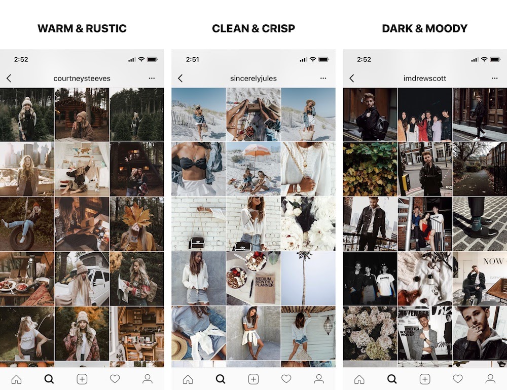
Your choice of color can have a powerful impact on your visual branding strategy. The right color palette can reinforce and amplify your brand’s message. In fact, there is a language or psychology to color that you can use to elicit specific emotional reactions in your audience. On one end of the spectrum are the warm colors. These are your reds, yellows, and oranges. These colors tend to evoke a range of feelings, from warmth and comfort, to adventure and passion.
On the other end of the spectrum are cool colors. Ranging from violets to blues and greens, the cool colors tend to elicit feeling of relaxation and calm. This ability to inspire emotion and communicate a certain mood is invaluable in establishing what your brand is all about. Let’s take a look at a few examples.
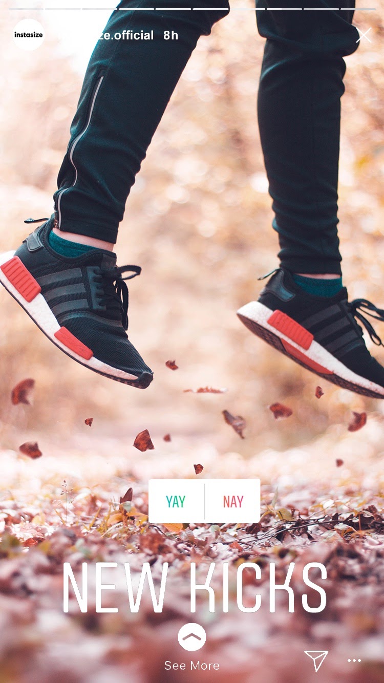
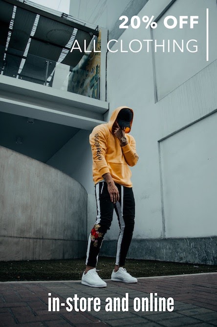
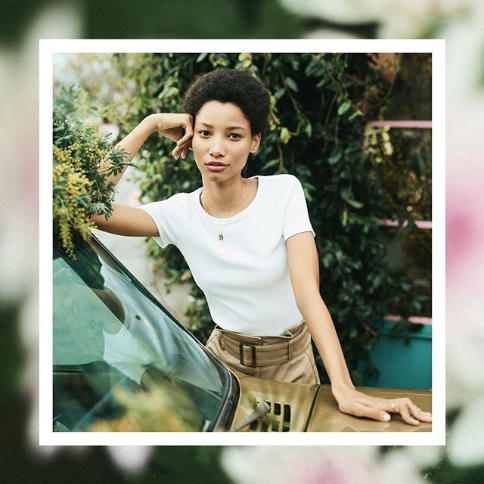
Bright and Passionate
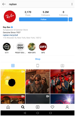
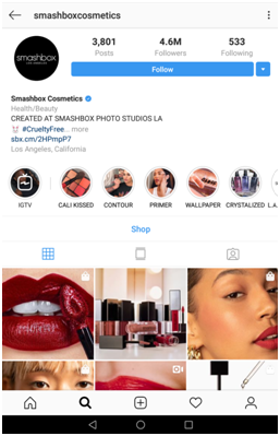
Sources: Ray-Ban, Smashbox Cosmetics
Here we have two brands that make excellent use of warm colors. Ray Ban makes great use of yellows and reds to project a brand image that is both active and playful. Notice how they also slightly desaturate some of their photos. This makes the picture a little less vivid, but also evokes an almost nostalgic feel reminiscent of faded photographs. The effect can help give a feeling of nostalgia to the image, which is perfect for the classic style of the brand.
Smashbox Cosmetics, on the other hand, use the same reds but in a more saturated tone. The lush vividness and bright colors of their palette defines their brand as passionate and glamorous.
Cool and Collected
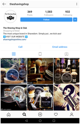
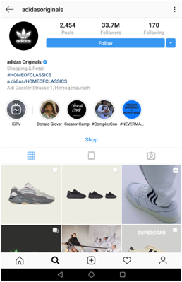
Sources: The Shaving Shop & Club, adidas Originals
Speaking of dramatic effects, adidas Originals creates an even more impactful feel with their almost monochromatic palette. By sticking to a stark, single-color background, the product really takes center stage in their visuals.
Playing Around with Colors
Once you’ve established what color palette you want your brand to own, you can try to incorporate these hues and tones in your images.
The quickest, easiest way would be to run your visuals through a filter that highlights the colors you want to show. You can try experimenting with the built-in filters of Instagram, or download a photo-editing app from your app store. Instasize, for example, has a number of filters you can choose from, as well as various border designs you can add to your image. Aside from using filters, adding a borders can also improve the color story of your visuals.

You can also use lighting to manipulate the colors of your images. Photos shot outdoors in the bright midday sun will look different than those taken at around 5pm, when the light is warmer and more golden. When shooting indoors, you can play around with lighting by changing the color of your bulbs or placing colored cellophane in front of your light source.
Of course, you can also choose to art direct the color of your shots. If you want a dominantly blue image, for example, you can simply choose blue accents for the product or use a blue backdrop.
There are many ways to highlight certain colors in the images you post on Instagram. The one thing to note is that when it comes to churning out great visuals for your brand, consistency is key. At the end of the day, the colors you use should be part of a visual language, one that clearly tells your brand’s story.
This guest blog was written by a representative from Instasize.
<< Back


15 responses to Using Color to Build an E-commerce Brand with Instagram
Great information! Thanks for putting it out there!
Color I can understand. Instagram used mainly by teens, I am not sure whether it is time worthy for those who sell vintage items.
cool
I love Instagram and virtually live there.
My page is…antiqueshopnyc & welcome your feedback!
Very good info, though it might not apply to selling my DVD movies where showing the cover is all you need.
Definitely interesting ideas. I might experiment with some colorful background images to add a bit of interesting complexity to an otherwise “basic facts” like picture.
Fantastic, I liked it a lot, Thank you very much.
Eva Kosmas Flores needs a mention here. The photos she takes for her food blog has profound impact with its dark violet moodiness. Her pages scream Eva Was Here. Great article. Thanks for pointing out the obvious-not-obvious.
Great blog, terrific info
good time with all
Thanks for the informative article. This is one of the best resources I have found in quite some time. Nicely written and great info, I really thank you for sharing it.
For any query regarding for this quickbooks support and activation Some details, Just Visit My website
https://quickbooks-support-number.com/
Great post Thanks.
Interesting. I never thought about cellophane in front of a light source.
Very informative read! Thanks so much for posting this.
nice
Login to see more comments